The data behind Goldilocks
Harry on why the figures aren't perfect but the message is clear

I love the phrase, “The devil is in the detail.” It aptly sums up how you need to dig through the weeds to get to the roots of information, especially when it relates to business and sport where confirmation bias can be all too prevalent. In writing the article, ‘Searching for Goldilocks’, the devil really is in the detail.
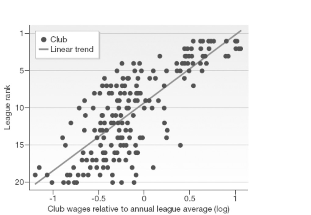
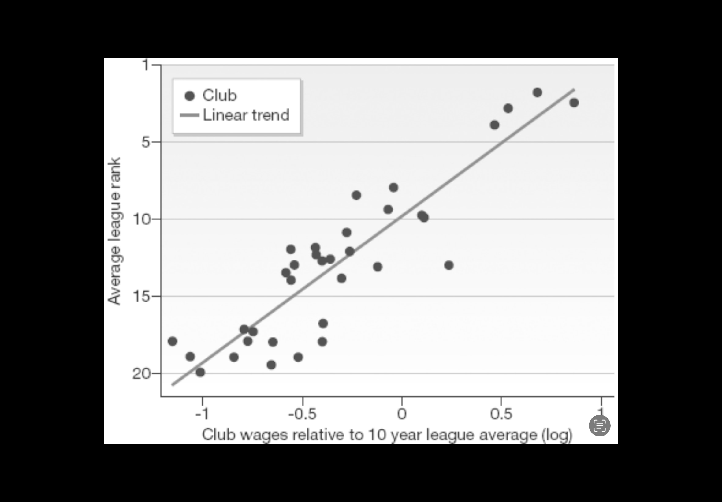
I must confess I am not a data freak and (with the greatest respect, James) this is exemplified when Juco James puts up a very specific and jargon heavy tweet about Hearts and/or Jamestown Analytics - by tweet number 3 of his 6 or 7 I’m off looking at dog videos. Having said that, I do enjoy getting digging down into the detail to cut through and find the root to truth, and the Searching for Goldilocks articles (one yesterday, another tonight) were inspired by two things. Firstly, the tables below (which I misattributed to Soccernomics, but are from The Numbers Game) illustrate a direct correlation between average wages of a football club and the average league position. It’s why minnows can win cup competitions, but very rarely win leagues. As we see regularly - you can have situations where teams outperform their average-wage league positions for more than a season and have a freak situation like Leicester or this season Hearts performing well if they get the structures, systems, recruitment and/or manager right and the teams with the higher wages get things wrong, but ultimately, over a three or a five-year window, everything reverts to the norm.